Woods + Dangaran | Art Advising
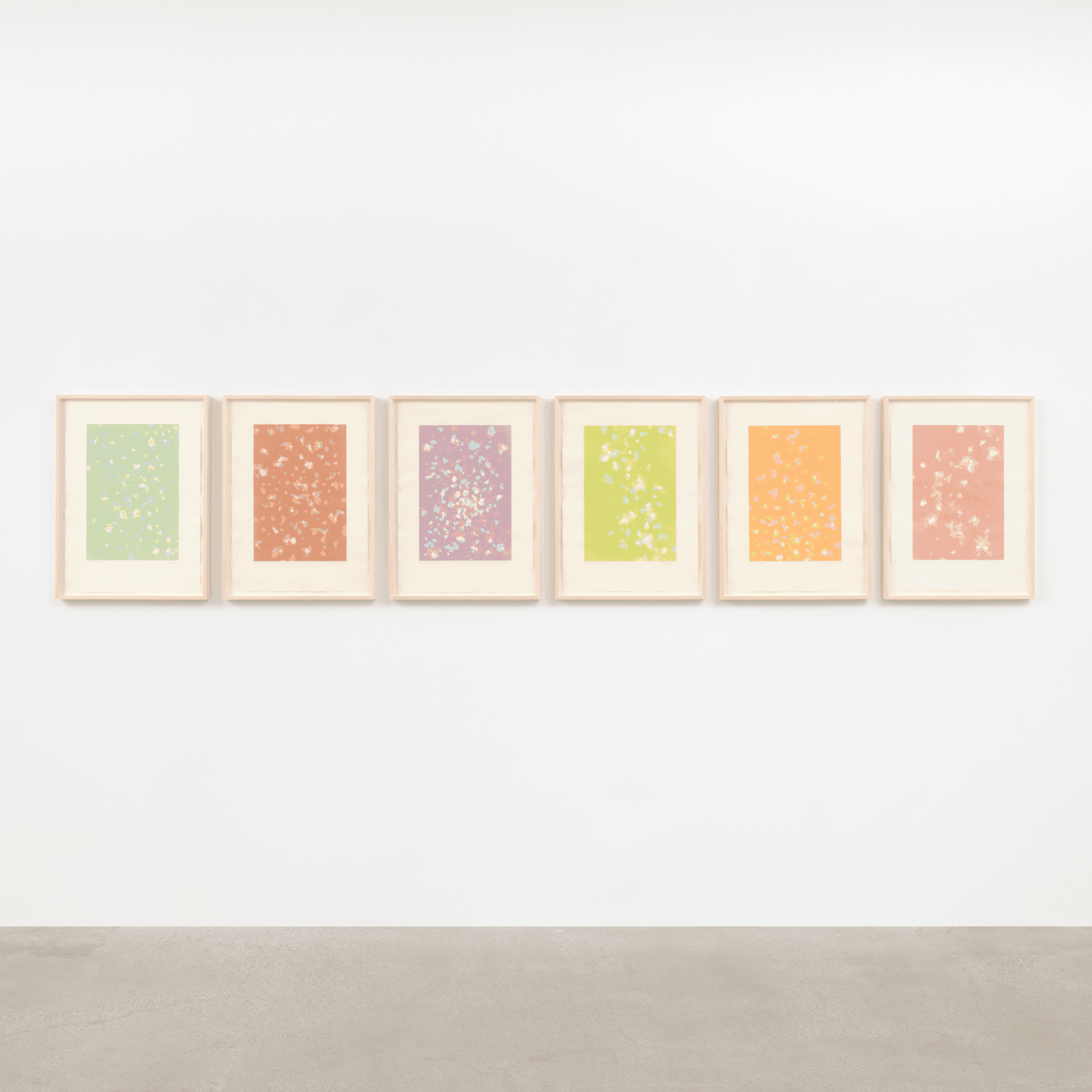
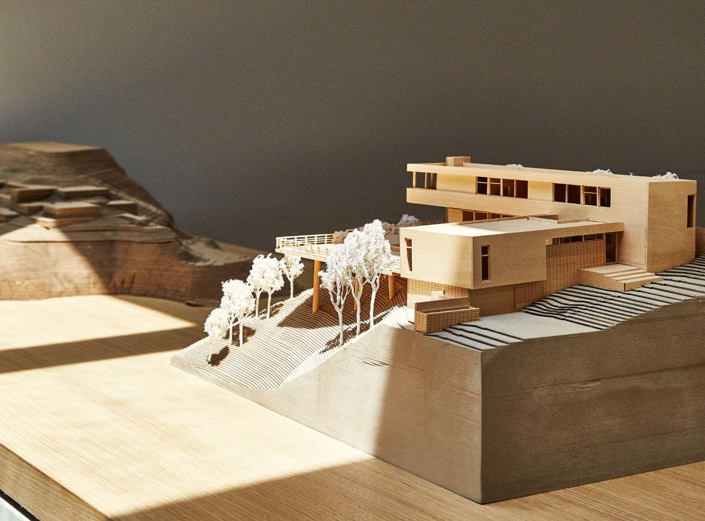
Woods + Dangaran create beautiful modern estates with nostalgic references and warm simplicity. When they decided to create their ideal office space they referenced their key inspirations behind their design ethos, including a lush cactus garden out front and moments for optimal daylight to peak in as the sun moved. For the art within the space they were drawn to the texture and shapes of Tappan artist Cheryl Humphreys, and ultimately decided on a commission series that would live in the multiple spaces across their open office design. We sat down with both Humphreys, as well as Brett Woods and Joseph Dangaran to hear more about the collaboration process.

Q&A with Cheryl Humphreys:
What was most exciting about this commission and the process of creation for you?
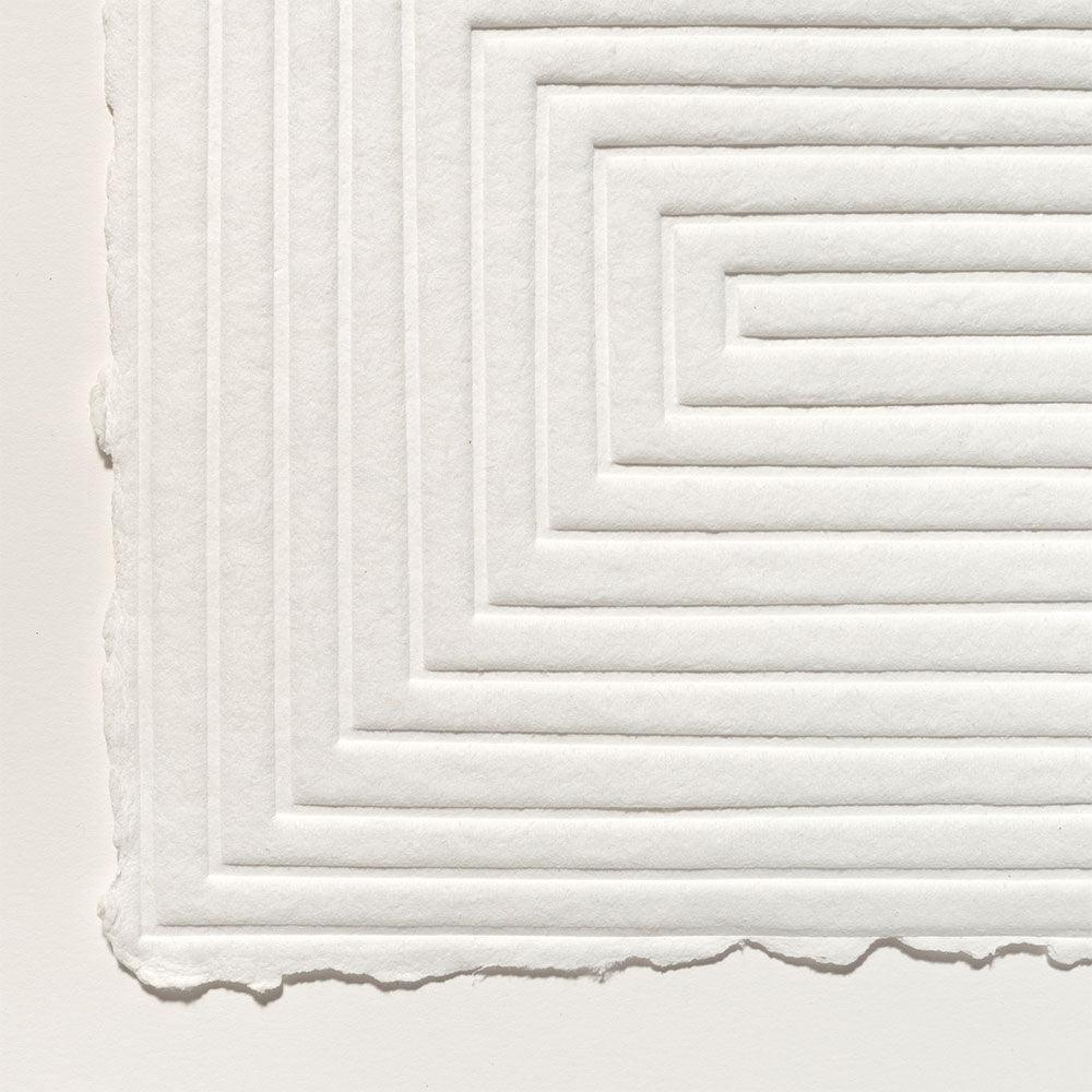
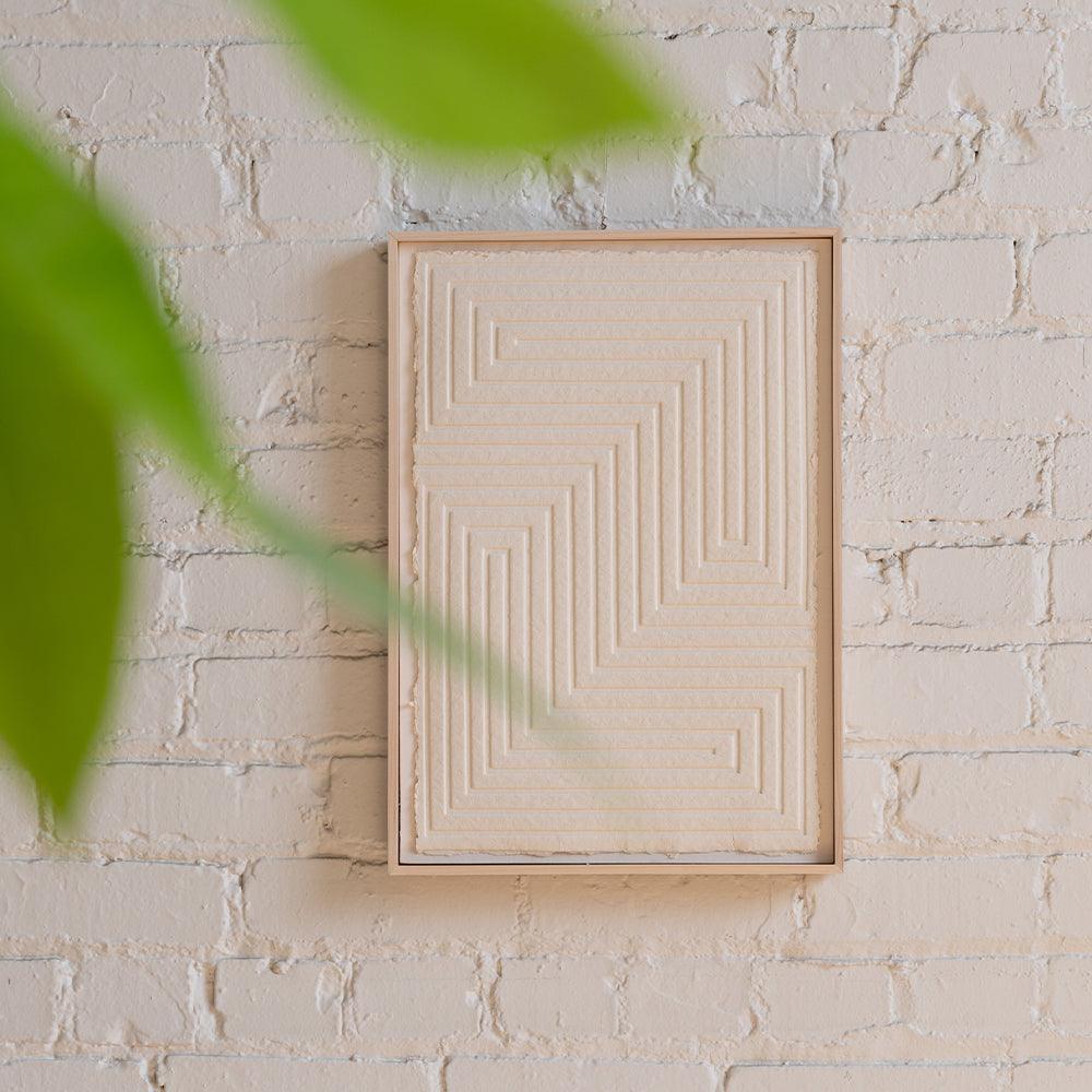
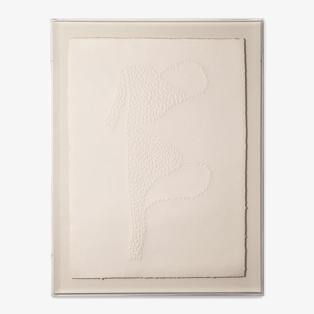
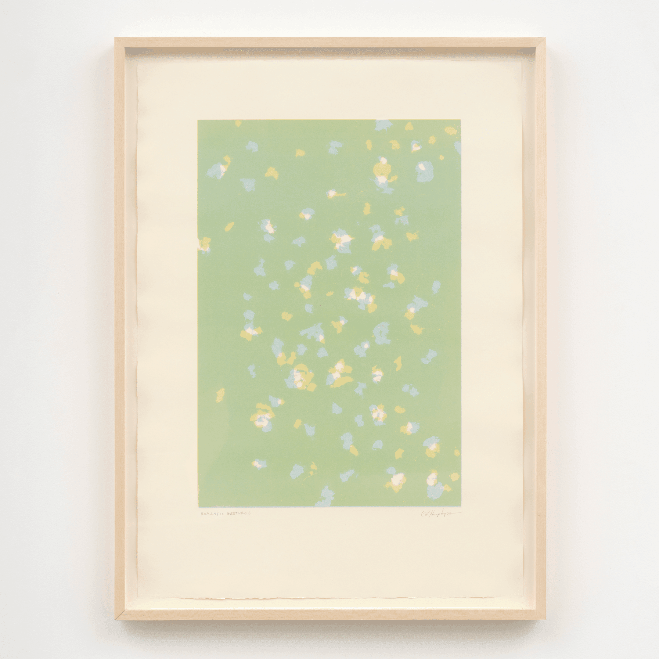
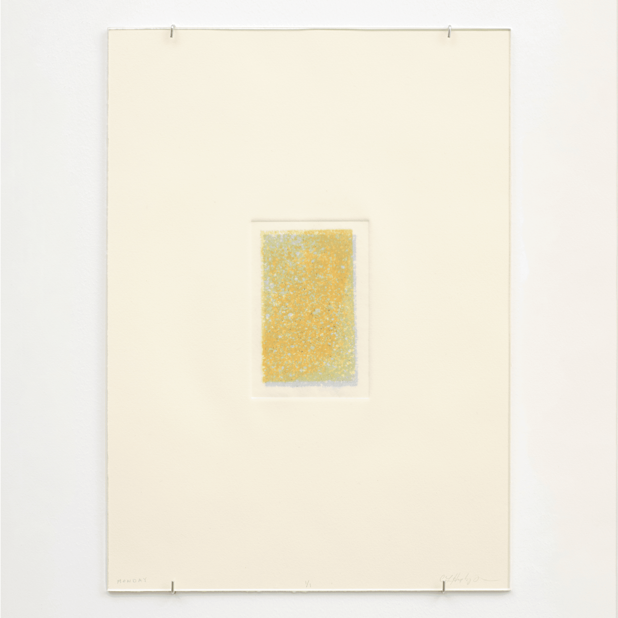
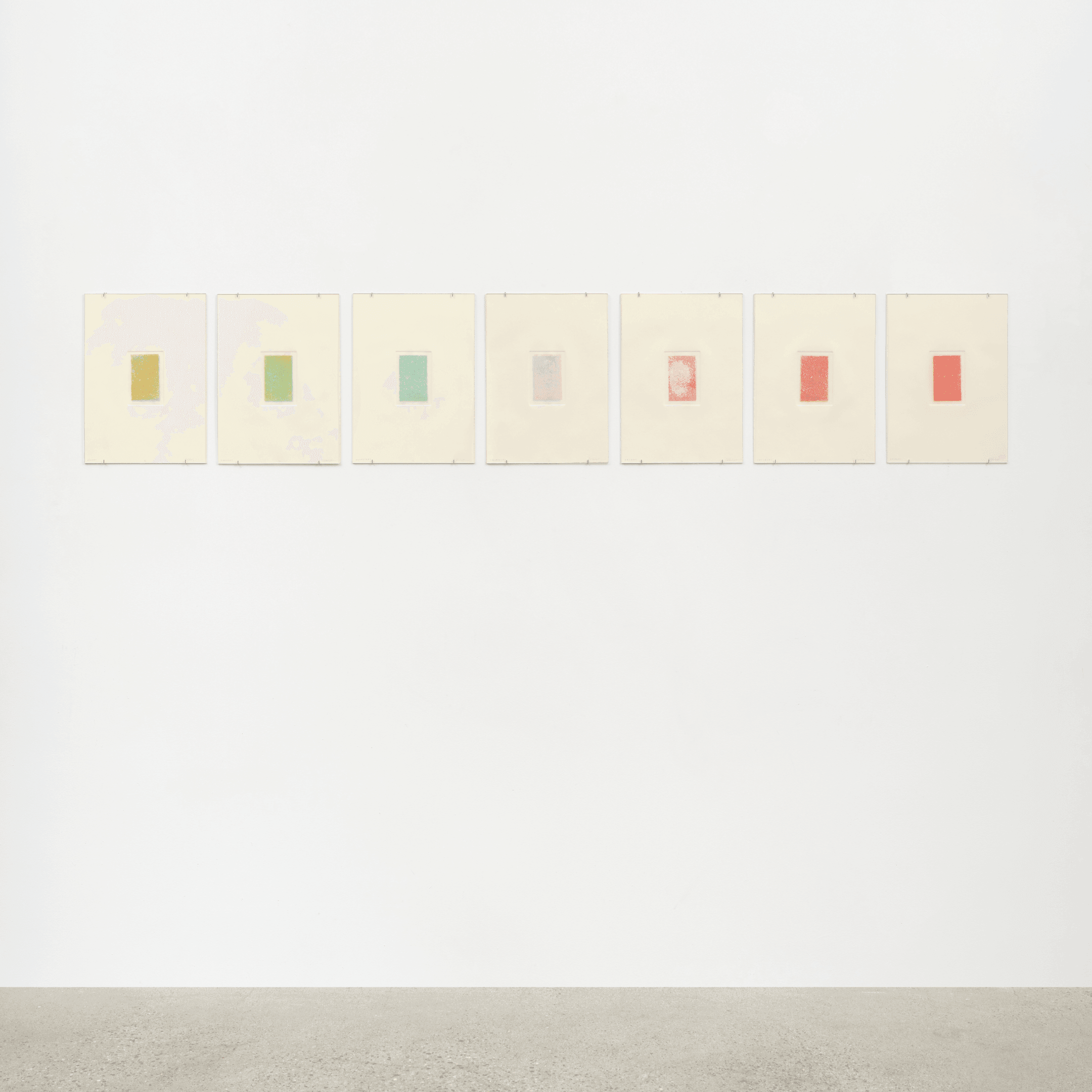
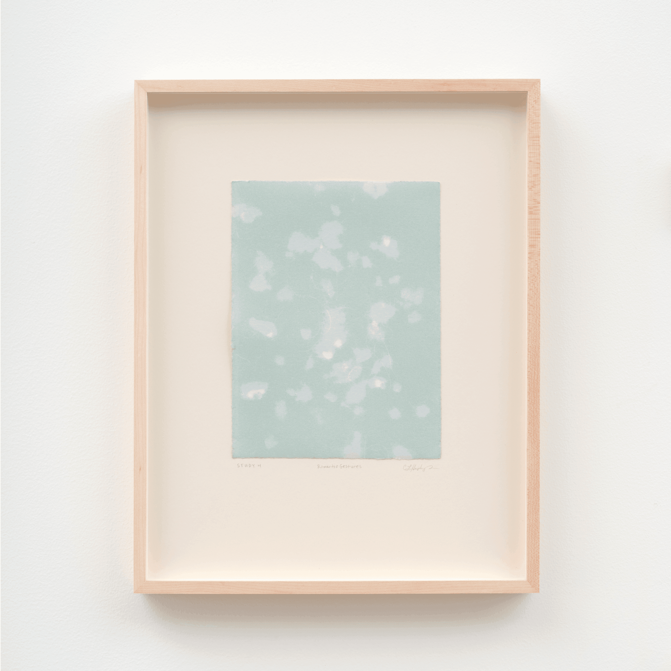
The opportunity for scale. I enjoyed the physicality that came with the process of working large scale, the connection I made with Brett and Joe, and the continued exploration that created this work. These studies are a response to the build up of prints that comes with constantly making. I challenged myself to discover connections in the “discarded”.
What are you most excited about in the coming year? How is your practice evolving? What can Tappan collectors look forward to?
I am looking forward to continuing this appropriation of my own work… seeing what I can steal from my own mistakes and exploration. I am attending an artist residency in Oaxaca, Mexico at the start of 2020. Oaxaca is known for its printmaking community and handmade paper. Looking forward to experiencing what this will bring to the surface.
Where did you pull the most inspiration from? Where was there visual crossover between the architectural elements of Woods + Dangaran, and your own practice?
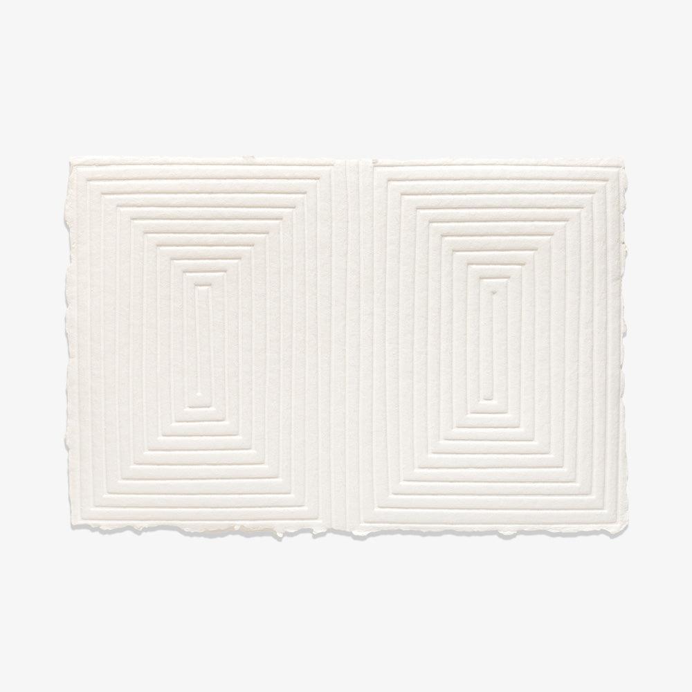
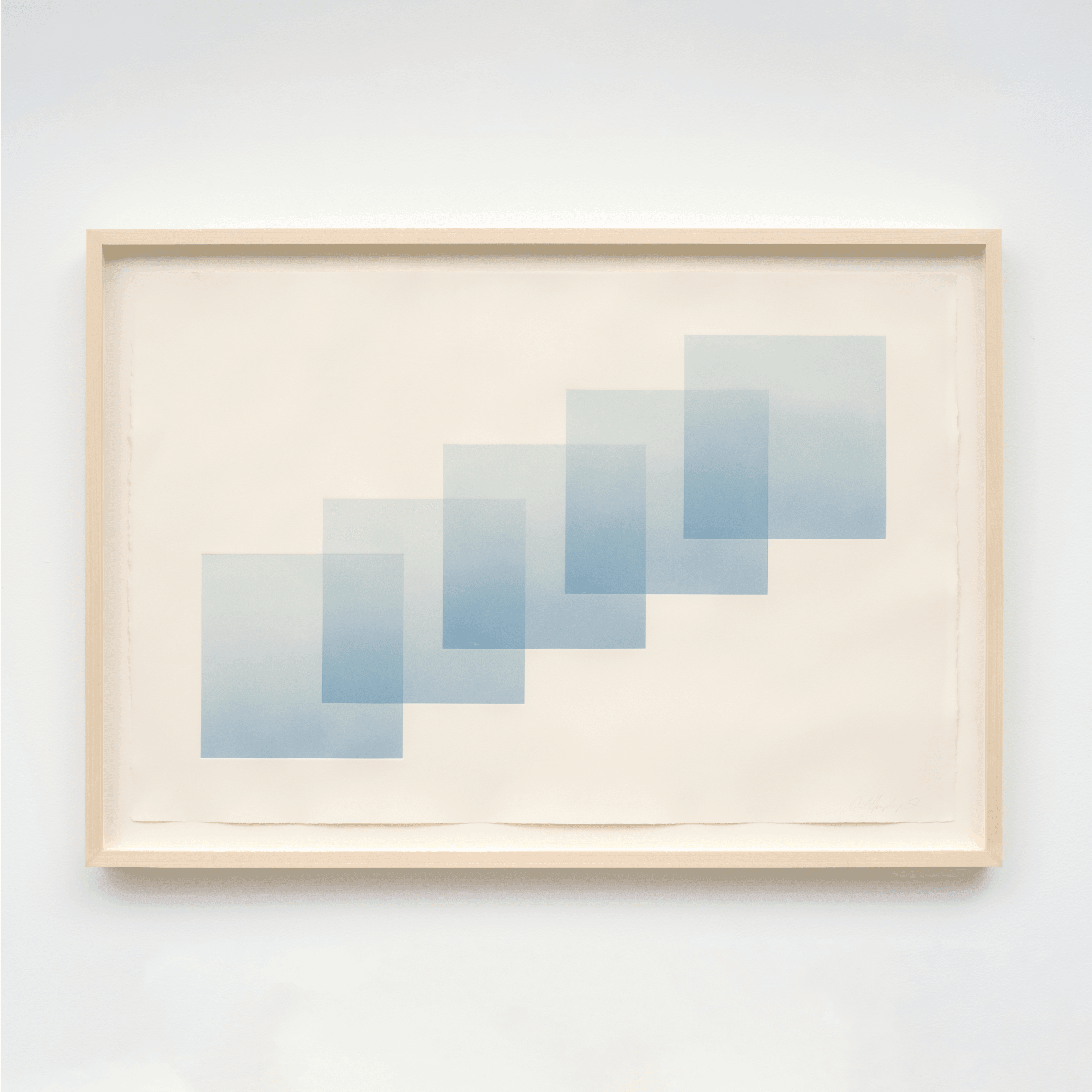
The inspiration for the five commission works came from the dialogue around both our work, including the space they had just designed and built where the final pieces were going to live. There was an immediate connection: the celebration of process, clean architectural lines, subtle transitions, and a respect for nature and geometry.
Out of the context of the commission what do you love about these works? How do they speak to you, or what story do they tell for you?
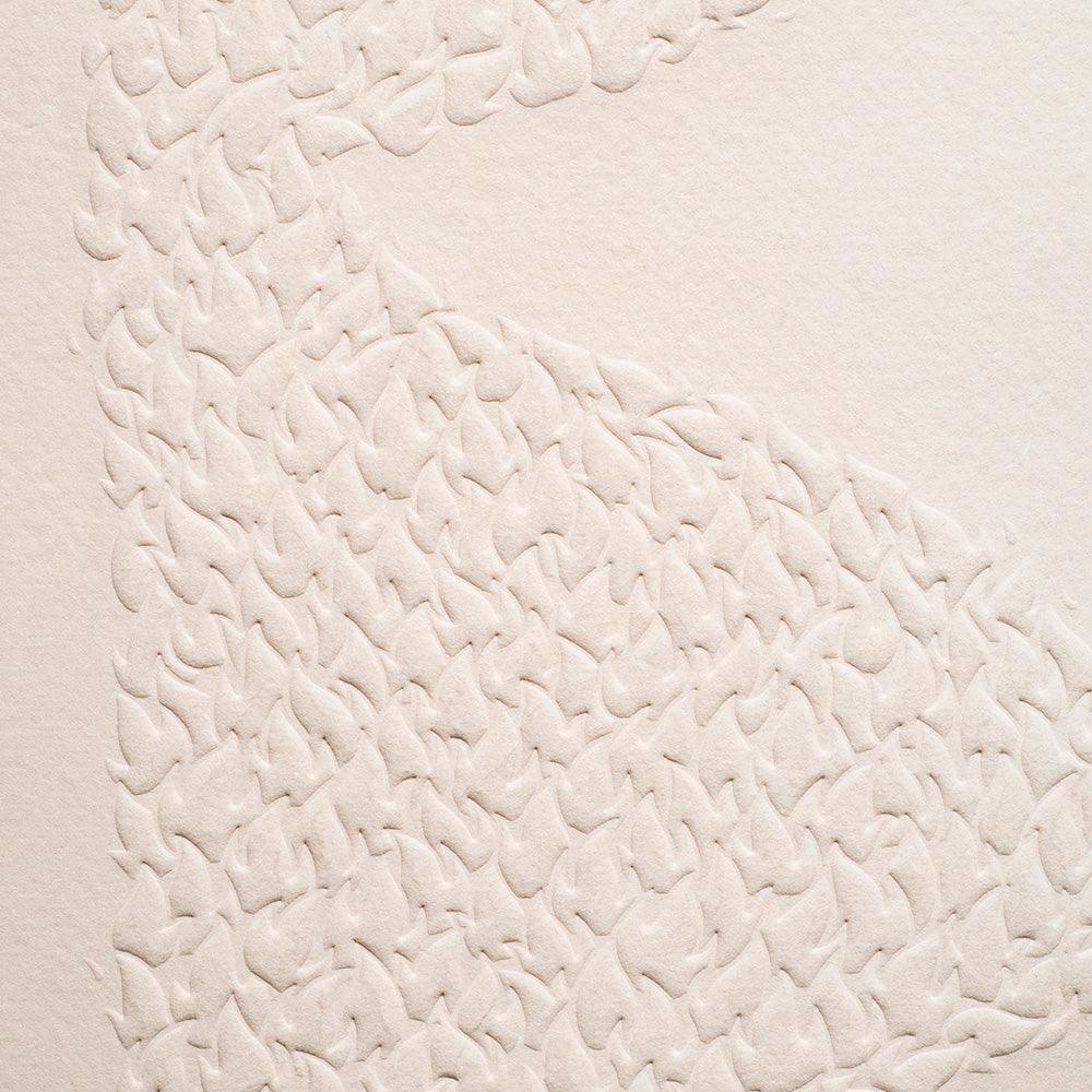
Each tile has been torn down from a test print or color study from the large scale piece for the main wall. These studies are not about the quality of each tile but what happens when one tile is introduced to another and the search for peace between the two.


Joseph Dangaran says
“We wanted the art in the space to truly be process oriented. The pieces needed to communicate the way in which they were made. we wanted them to have depth and be tactile in some sense.”

Q&A with Brett Woods & Joseph Dangaran:
Tell us about your firm. What inspires you guys? What is your vision for the firm moving forward??
As cliche as it may sound we want to do great work with great people. We have been fortunate to attract some really great collaborators as clients who love the experience of working with our team. For us we are interested in projects of varying scales as we approach each with the same process. Our process can apply to a 2,000 square foot home or a high-end condo building. Our vision is to grow the firm responsibly, to keep attracting exciting projects and to always be prepared to take on the next great opportunity.
The materials you use truly integrate into the natural landscapes in which you're designing in. How do those landscapes define your design ethos in each project?
We believe that each project needs to speak to the specific context, whether that is an estate on acreage or a standard urban property. The context informs the materiality, scale, positioning and the landscape architecture of our designs. We believe in using natural materials vs. synthetic materials and colors. Scale, texture, pattern and finish gives us the opportunity to use a reduced number of materials in varying and nuanced ways throughout a project.
What were you looking for when it came to integrating art into the new office space? What are you both naturally drawn to and what compliments your designs?
We wanted the art in the space to truly be process oriented. The pieces needed to communicate the way in which they were made. We wanted them to have depth and be tactile in some sense. I think it’s fair to say that Brett is attracted to more brightly colored art, pop art being a good example, where I tend to be interested in art that is much more abstract and muted. We find a balance of these characteristics in Cheryl’s body of work which is why we were both drawn to them. In our designs we strive for the structure to be background to the life and energy that the user fills it with.
What was the collaboration process like with Cheryl? What did it look like working together?
Cheryl and the team at Tappan were great to work with. Cheryl found inspiration in some of the elements of our studio, our “artifact table”, which is covered with all types of material samples, and our gardens, which have a wide range of cacti and sculptural plants. Similar to our process, she presented a number of initial sketches and then iterated on the ones that we were drawn to.
Any exciting projects coming up you'd like to share?
Our specialty is in high-end, custom residential with an expertise in the difficult hillsides of Southern California. We have a great team in the studio working on some exciting new projects. On the horizon we have a few estate properties, a boutique hotel, some historic renovations and high-end multi-family. We are excited with the opportunity to work on more public facing projects.
What are you guys excited to collect next (either for the office or personally)?
We commissioned Cheryl for three major pieces at the studio, so at this point we are all out available wall space. I have personally been interested in ceramics for some time but I haven’t found any specific piece yet.


