Rachel Sherman | Guest Curator
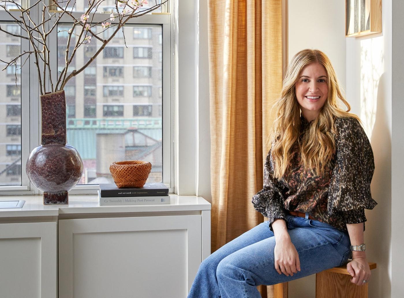
Rachel Sloane Interiors is a boutique design studio based in New York City. Founded in 2019 by Rachel Sloane Sherman, RSI is a full service design firm that specializes in residential design.
Rachel began her career in digital marketing at Ralph Lauren before deciding to follow her passion for interior design. She interned for Jeremiah Brent Design in New York and then moved to Washington DC where she cut her design teeth while working for Zoe Feldman Design.
Today, Rachel is happiest sourcing for her wonderful clients and pulling together design concepts that help them realize their spaces’ potential.
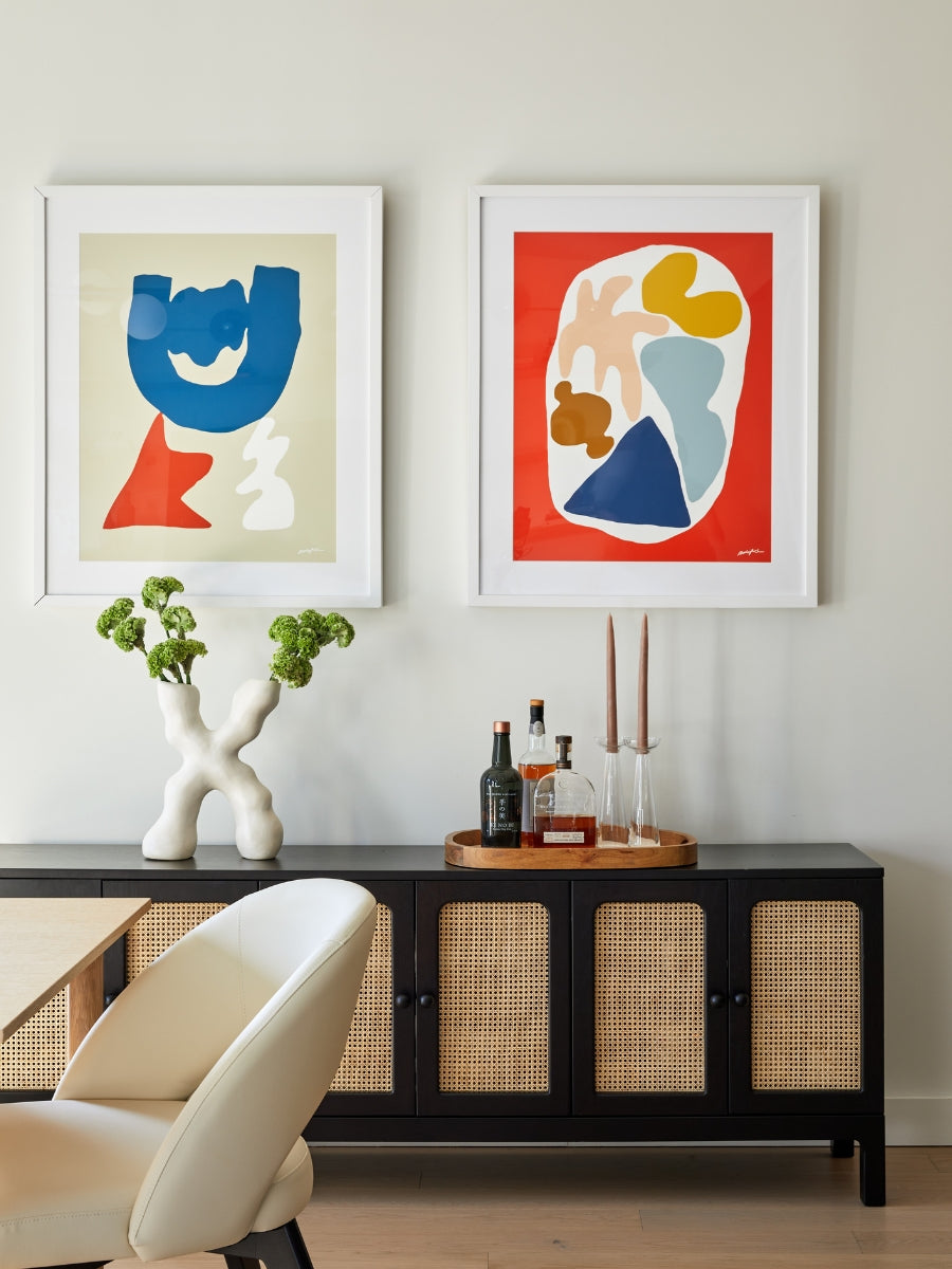
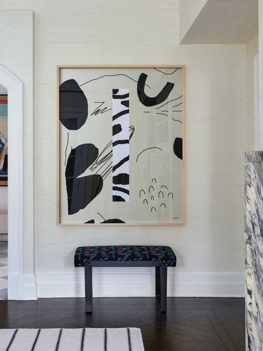
“The more I look, the more I’m convinced I need it so I can stare in awe.”
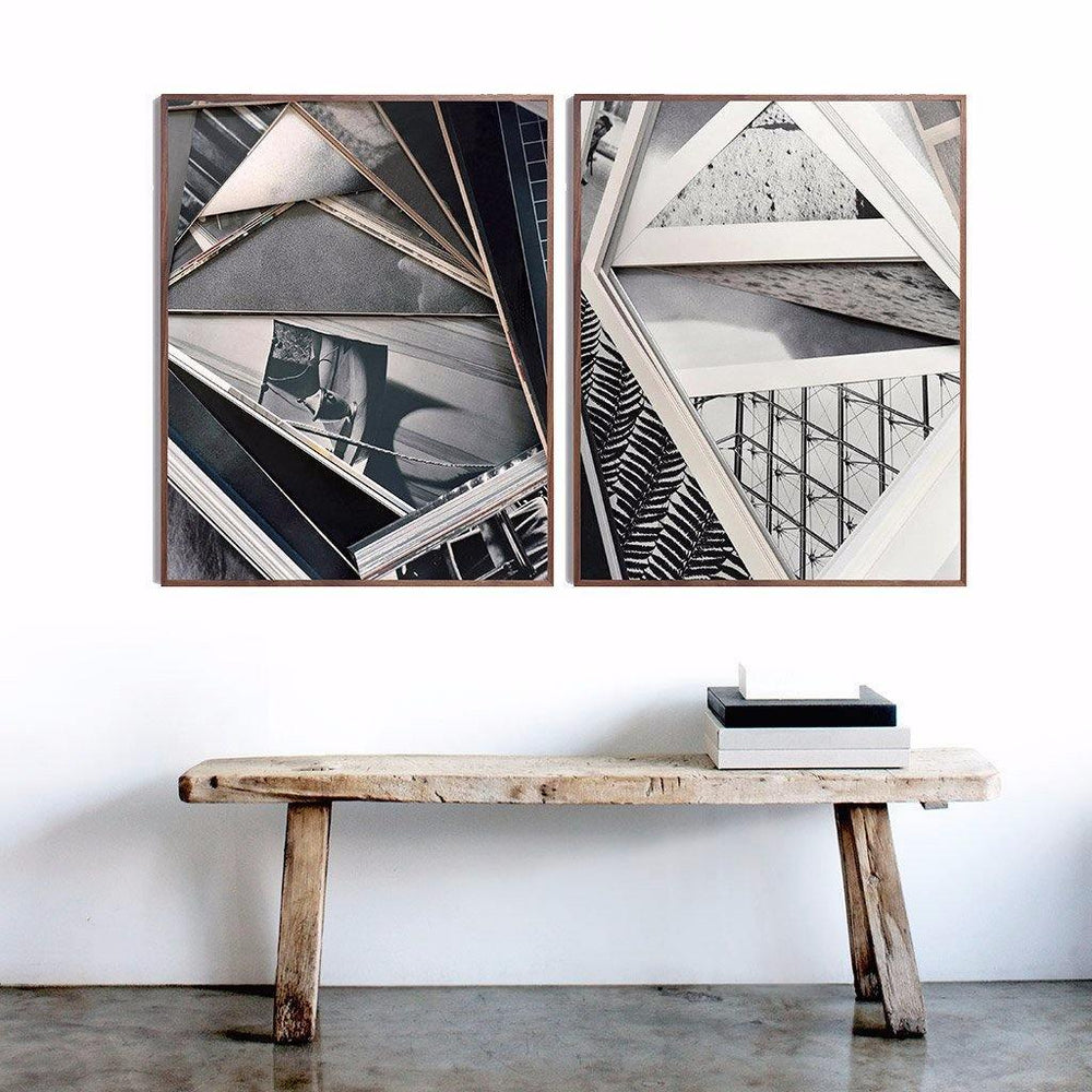
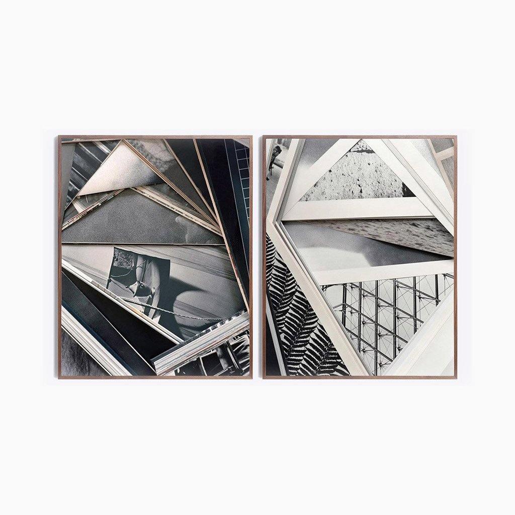
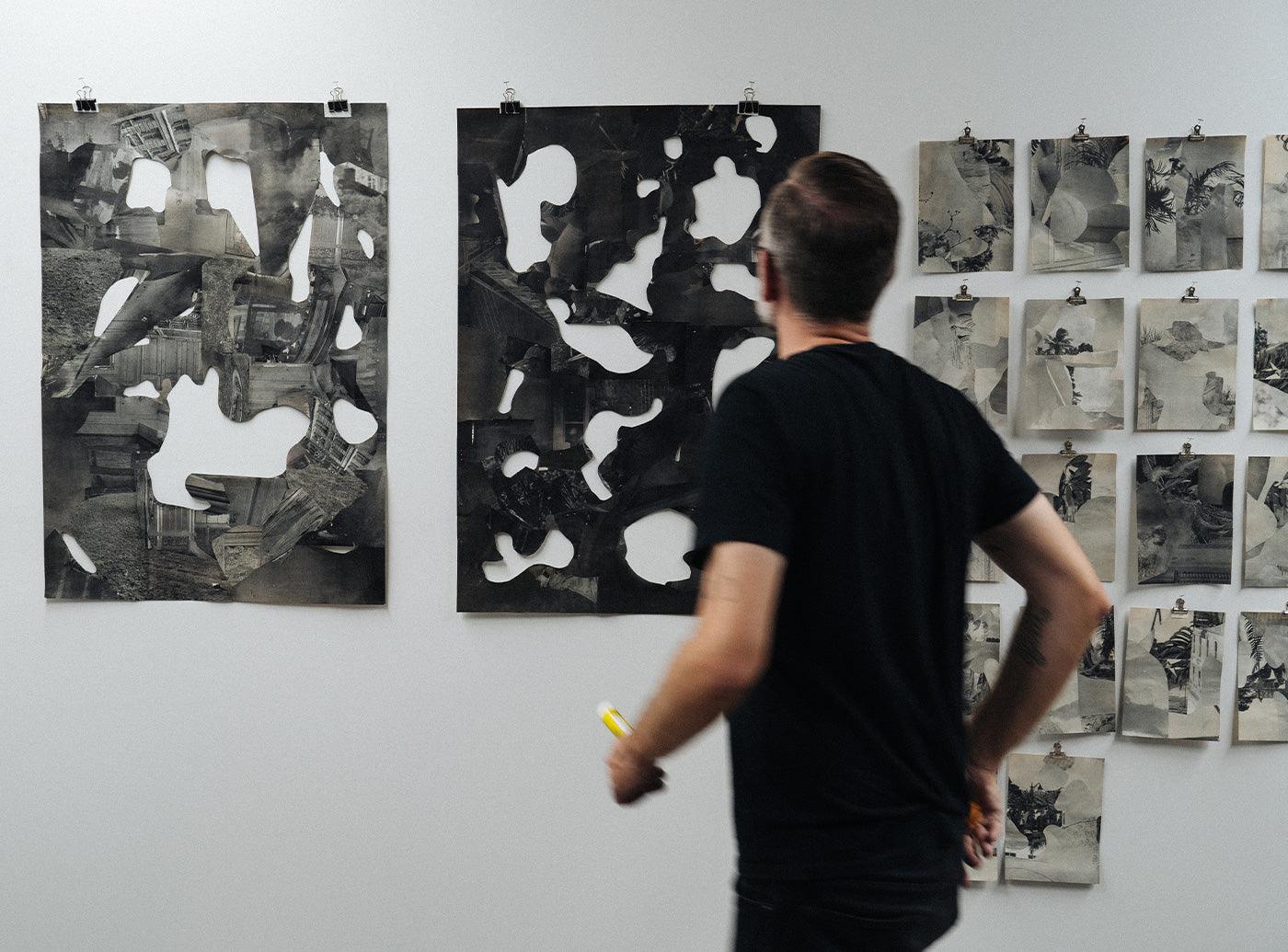
“Kitz’s ‘Invisible Envelope’ series reminds me of the dozens of magazines I used to spread across my bedroom floor to make collages when I was growing up. This strong element of nostalgia, plus the fact that his art is neatly contained in a frame and not an art project that I need to clean-up, make it a win-win for me.”On David Kitz's Blacks And Whites Diptych
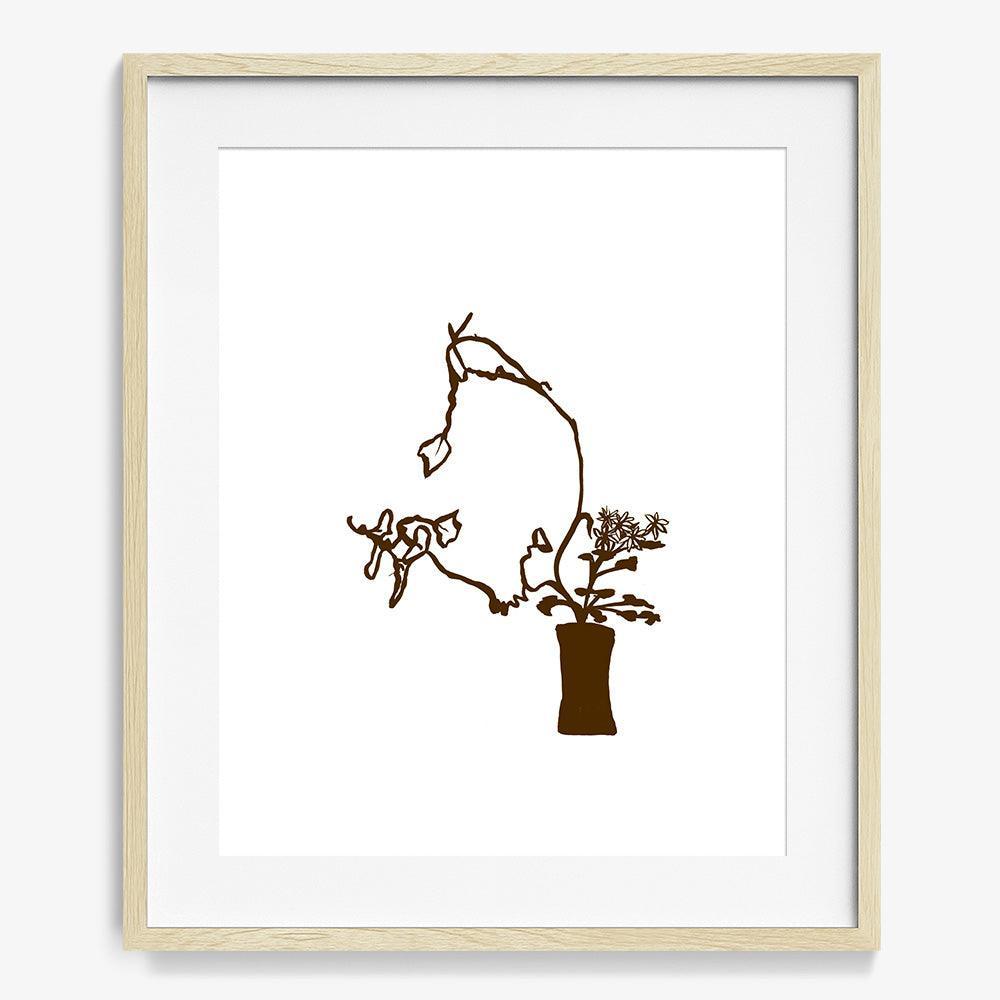
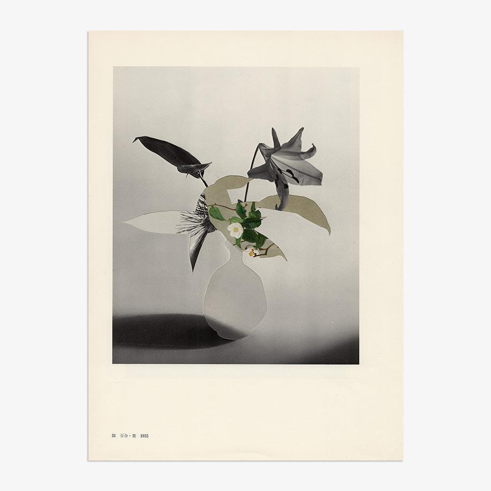
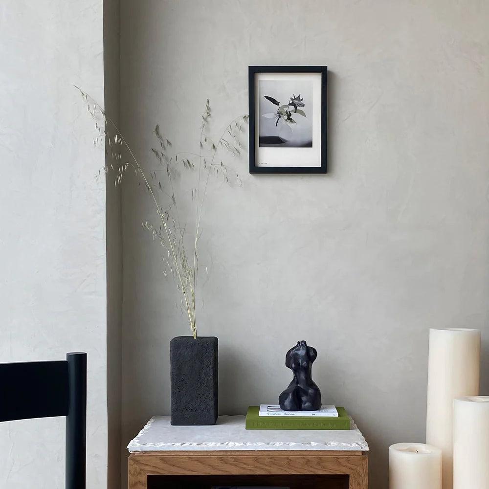
“Flowers bring me joy, but oftentimes flowers as an art subject fall flat. But, when done right, flowers can inspire something magical. Teardrops from Veraldi’s series Ikebana Imagined Drawings has masterfully captured the nuance of its subject using organic linework, asymmetry within the frame, and a single color that beautifully unifies the vessel and the florals. This might be good enough to replace my actual florals!”On Dana Veraldi's Teardrops
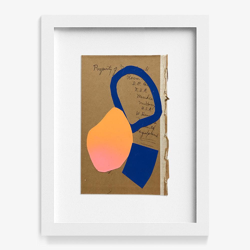
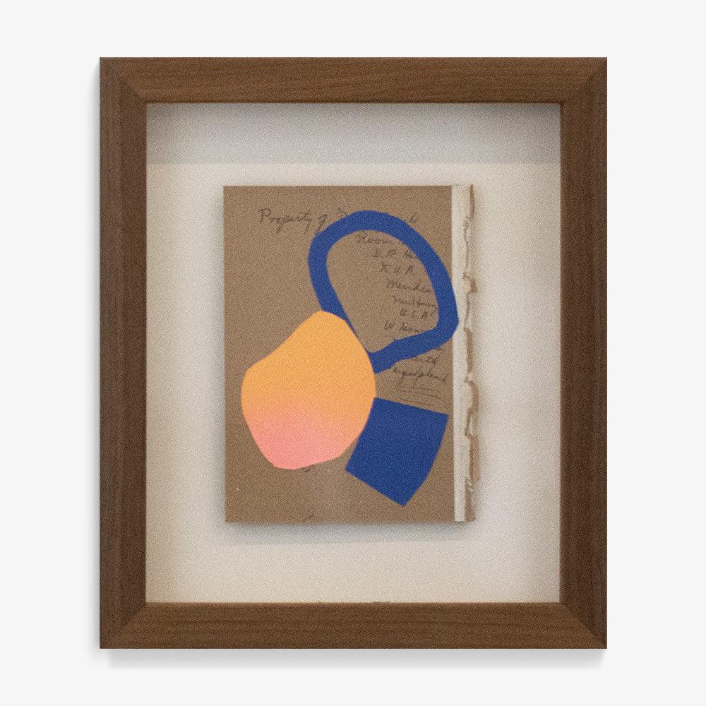
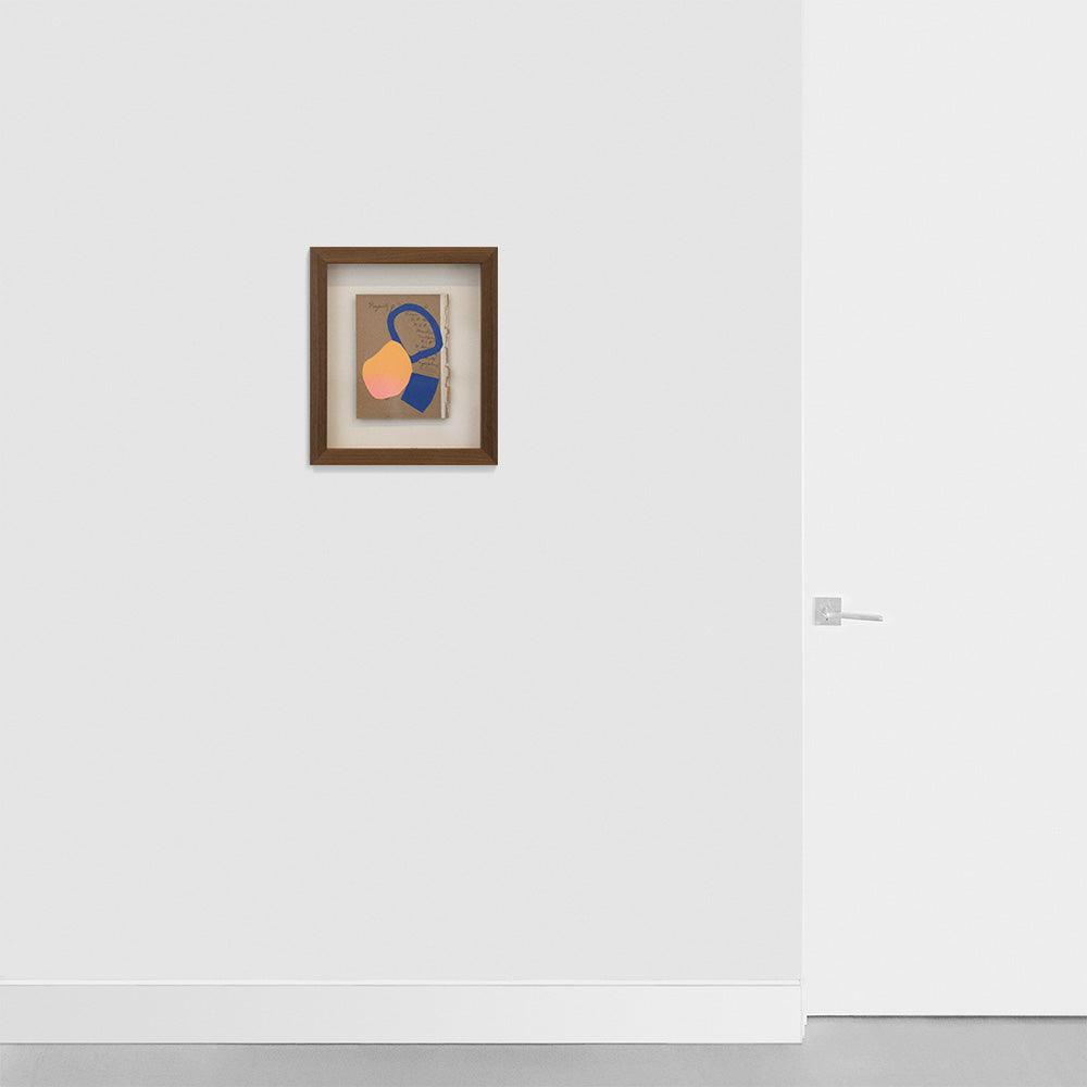
“I’m a sucker for unique color combinations, collage, funky shapes, and– man oh man– using a page from a book as a canvas is basically perfection for me. Here, I feel the physical layers task your brain to unpack the meaning in a way your morning puzzle might: in a different way everyday but within the same framework. Who doesn’t want their artwork to provide a little mental exercise?”On Tadahiro Gunji’s Collage4C_56
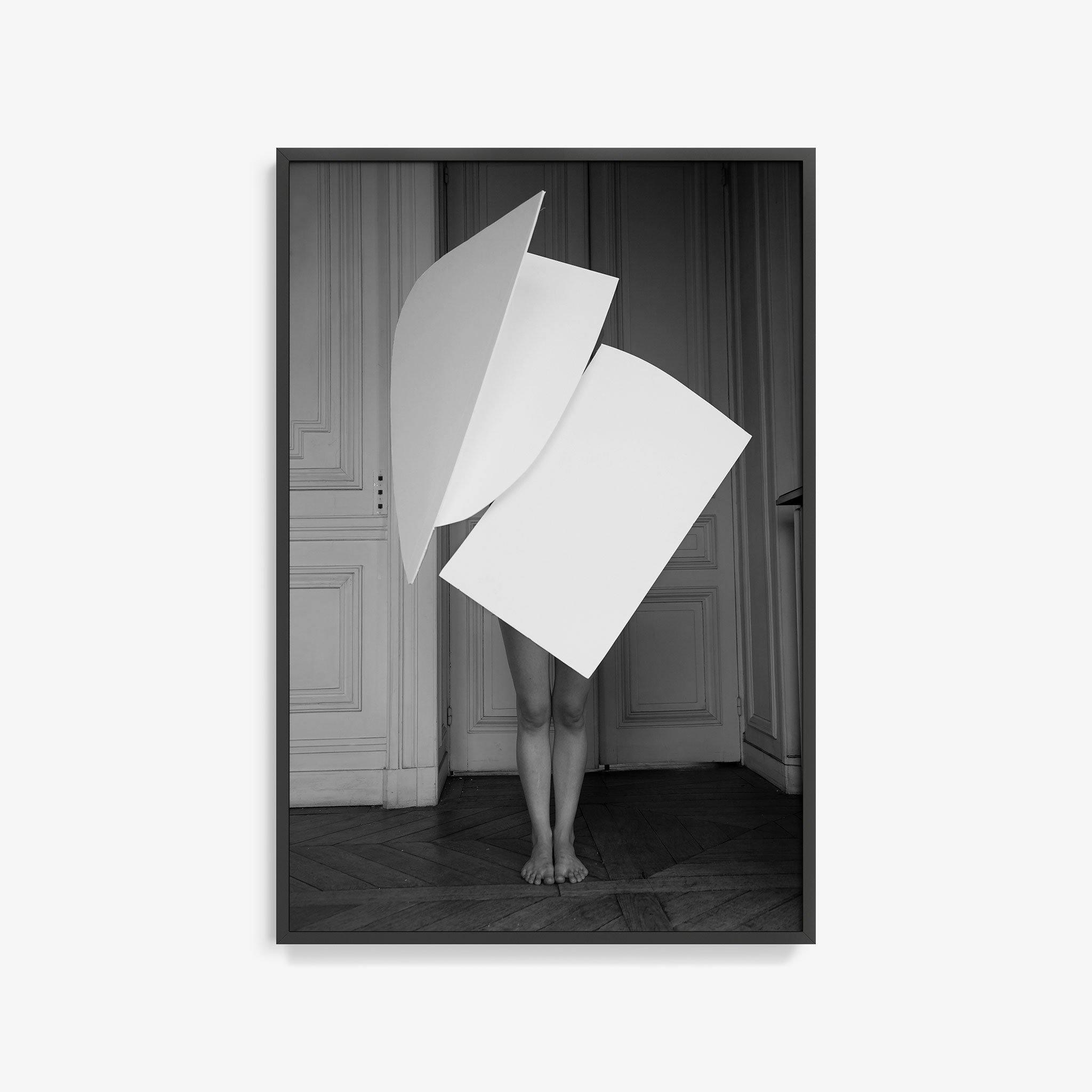
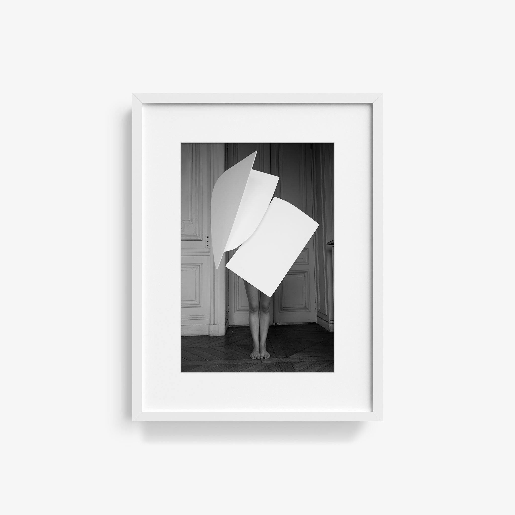
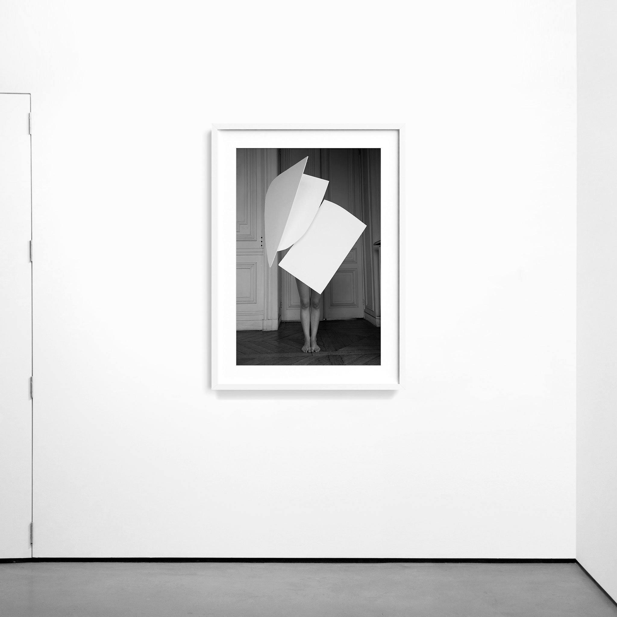
“I have been eyeing the Heidies Form series for awhile. It combines so many things I love in the most creative of ways: sculptural elements, the human form, black and white photography, and a background that screams “good bones” (check out that wall paneling and herringbone floors!). All of that plus a dash of whimsy that just delights.”On The Heidies’s FormH2-2


